This post has been on the back of my head for a couple of years now. I think we actually switched-off Intercom in 2016 or so… But the reasons should still stand now, or might even be stronger. Of course, things might have shifted, so please forgive me if some features are totally different by now.
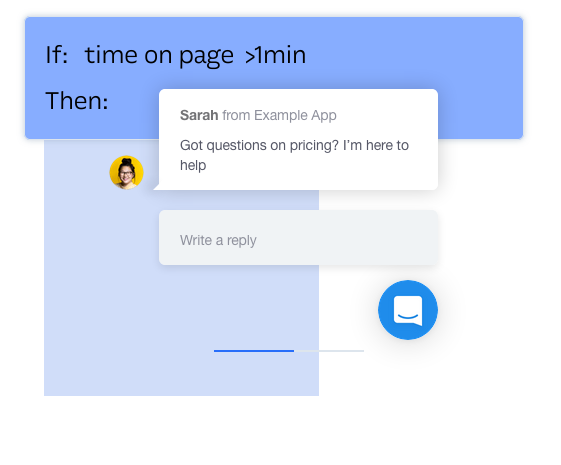
For those who don’t know intercom.io (now intercom.com), well, I think you probably do know it, but maybe not by name. It’s the technology (or company) that adds those little “bubbles” on websites, with friendly faces offering to help.

Of course, intercom.io isn’t the only one now, and there are a few competitors in this space. The principle is pretty similar though. I think intercom was the most successful company doing this, or the first, or both. But it’s not really important. It’s mostly about intercom as a concept, rather than a specific implementation.
TL;DR
The short, simple, and most crucial reason: it didn’t work. How do I know? We A/B tested it. Over a fairly long time and a large number of people.
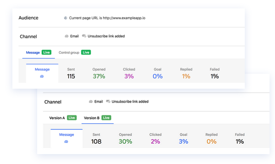
Our A/B test
Half of our users would “enjoy” the full intercom experience, with helpful messages trying to guide them, offer tips, get them engaged and ask for feedback. The other half got nothing. And we couldn’t measure any increase in conversions with intercom in place.
Ok, you might say that we did it wrong, and maybe we just weren’t clever enough using it properly. After all, it’s just a tool, and it all depends on how you use it.
But we certainly didn’t start off with the intention of it failing us. We were completely excited about the prospects of intercom. It was fairly easy to integrate and use, supported pretty much all the analytics and metrics that we cared about, and we used and optimized it for a number of months or even years.
We wouldn’t waste all this time and effort if we didn’t think it can help. But it really didn’t.
One interesting thing here. intercom offered built-in A/B testing of messages. It wasn’t so great — lacking statistical robustness to analyze results, and other things like setting different goals, at least at the time. But this wasn’t the biggest problem.

The biggest one was that there was essentially no test against zero (no) messages. You could test one style of popup against another, choose between two clever copy styles, but you could not test the effects of a popup, vs no-popup at all.
That’s where we eventually did our own test, and decided to go with the atomic option: all-in with intercom, or no intercom at all.
And that’s where we were surprised to see that it really didn’t move the needle.
A victim of its own success
Now let’s try to speculate why intercom failed us. Or why we weren’t able to make it work. Let’s give the tool the benefit of the doubt, and question our own skills as marketers.
But no marketer can escape the fact that intercom is hugely popular. I don’t have any stats, but I keep seeing it on SO. MANY. WEBSITES. The friendly bubble is just everywhere…
So from a novelty thing, it becomes “oh. that bubble again”. At least to me. And it definitely didn’t help knowing how the sausage is made. The magic is gone. All is left is irritation.
I think nobody has the illusion that there’s someone actually there. It’s obvious that it’s just a trick to get you to do something.
Its popularity transformed it from a cool and novel growth hack, to a dreary and predictable annoyance.
Support tool
As a support tool, intercom is not that bad actually. Being familiar with the bubble, and knowing that I’m just a click away from being able to ask a question is great for me as a customer. And some times I would even get an immediate answer. That’s a nice surprise (although more often than not, the friendly face isn’t actually there immediately).
I think this is where intercom and the likes still serve a good purpose. Maybe even shine. It is a friendly way to ask for help.
I still wouldn’t choose intercom as my support tool though, because I expect it being blocked by lots of ad blocker extensions (due to its tracking), and also it feels like an overkill for something reasonably simple.
Intercom is a beast by now. With lots of modules and options. Plus, its email support flow is lacking in my opinion. Maybe things improved since we used it, but even as a customer, I still think it’s inferior to other options (We use Helpscout by the way, and are much happier with it). First of all, it’s almost always obvious that it’s going via intercom (yes, businesses can do something to fix it, but many don’t bother and the email address and signature gives it away). And the whole interaction flow via email feels slightly awkward. It’s not plain-email, it’s intercom-email.
Intercom is a crutch
This is often hard to see, but when you get into the mindset of “Let’s help our users discover what our platform offers”, you’re many times missing the elephant in the room: Why do your users need help? why can’t things be simple and obvious and clear enough that there’s no need for it?
And yes, I’m no UI/UX expert, and I can imagine that the SaaS tool that helps you do your taxes might be a bit less intuitive than the iPhone calculator app. So some apps do need some help to get familiar with.
But once you start getting used to intercom being there, helping your users, pointing them in the right direction, making sure they follow some path you have in mind… that’s where it becomes a crutch. You need it. You depend on it. And you some times stop fixing obvious or not-so-obvious problems with your own user experience, and become enslaved by the “intercom experience”.
Other gripes
There are a few other things that I distinctly disliked using it. Pricing was a big one. Their pricing structure was absolutely horrid. They split their product into sub-products, but in a way that features that seemed logical would only be included in one sub-product, and not the other. If I recall, just to allow responses to use thumbs-up or thumbs-down required a whole plan or package, and to use bigger popups a different one, so if you needed bigger popups with thumbs-up, that’s two separate packages.
You quickly end up needing to get everything. And this naturally shoots the price up. It just felt manipulative and greedy. I’m fine paying a premium price for a good product, but this just felt like being squeezed.
Another annoyance was how heavy the whole thing was. Loading the intercom popup made loading pages slower and heavier. We also experienced some JS errors, as well as API errors (422, 500), messages that didn’t show or disappeared, and various other bugs and problems.
And the smallest, but perhaps most irritating of all, is how messages are sent as soon as you click Enter. So if I, as a customer, type a message like this
Hey there, can you guys help me with suchandsuch, I can’t seem to figure it out.
Cheers,
Yoav
It would typically send my message immediately… Cutting off where I would sign-off with Cheers and my name… It made me feel impolite, and irritated for not being able to edit the message or format it.
This makes sense for a chat, I suppose. The medium dictates it. But not all support requests deserve to be degraded to txt spk and emojis.
Is it only me?
I don’t exactly regret using intercom. At the time I saw lots of potential. And of course it’s entirely possible that we just didn’t use it in the most optimal way. Maybe too little? or too much?
I would still advise anyone who takes on something like intercom to test it against nothing. Don’t fall into the all-too-easy promise of stats and conversion rates and a/b tests for various messages etc. If it works for you, and really helps your customers and delights them, that’s great. But don’t assume a tool, however slick, is necessarily going to solve your problems. And also, don’t forget to take a cold hard look at the usability of your site from time to time. If you see that you need something like intercom to explain things, maybe there’s a potential for simplification right there.


2 replies on “why I stopped using Intercom”
Curious, have you found anything better?
I struggle with most of the things you mentioned and would love an alternative!
We’re using Helpscout for customer support, and also use Olark, but Olark only on the pricing page. So if someone has question related to payment, we can help (it’s offline though always, never works as a chat).